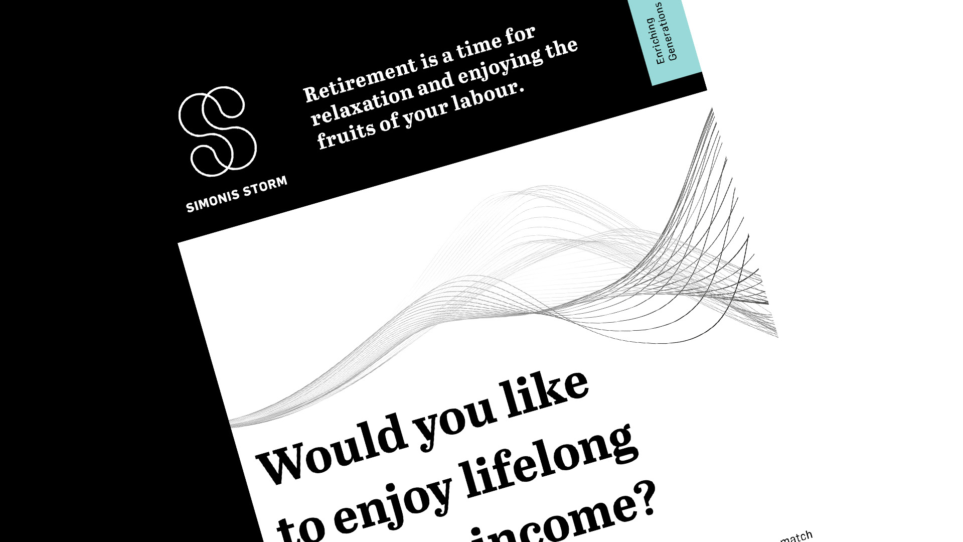
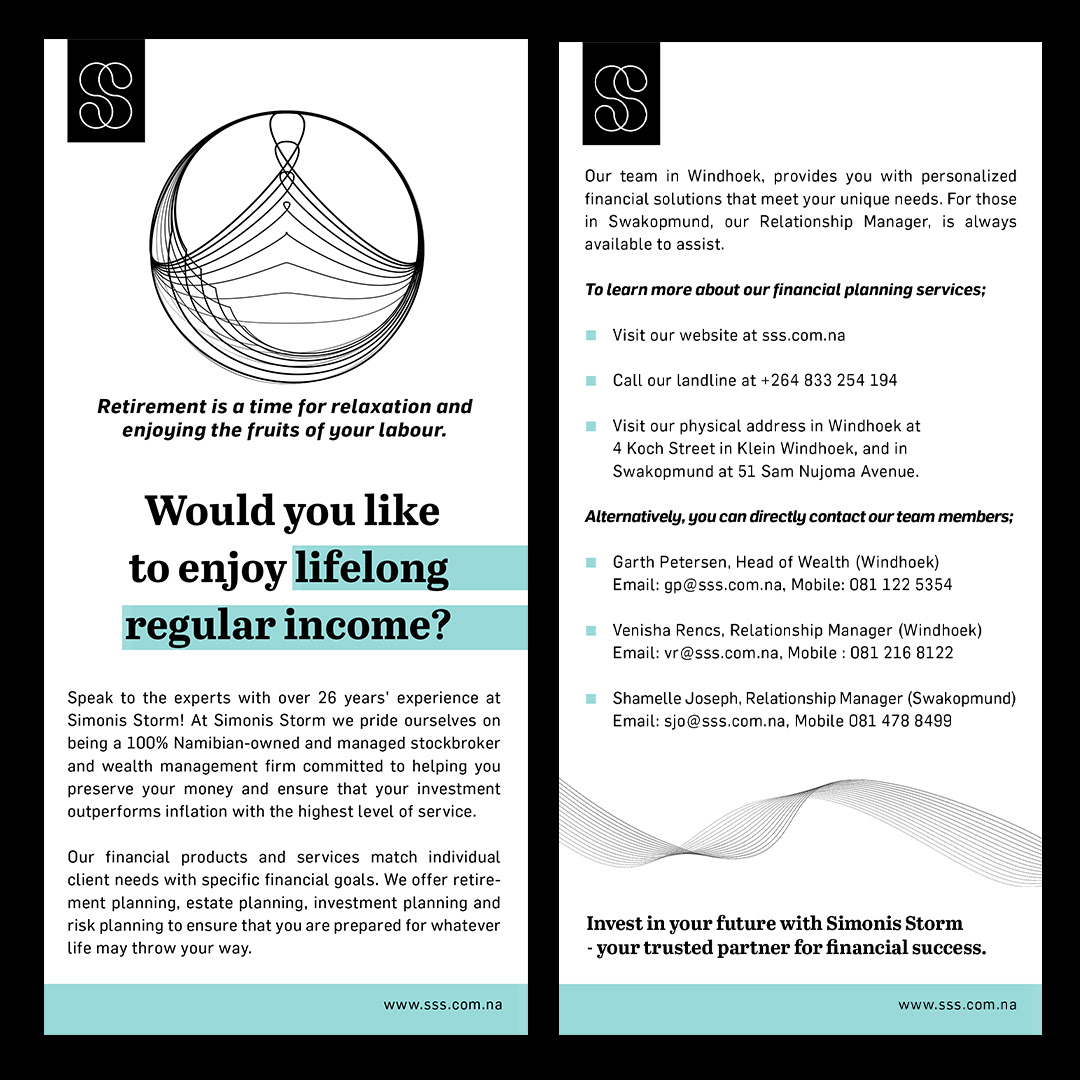
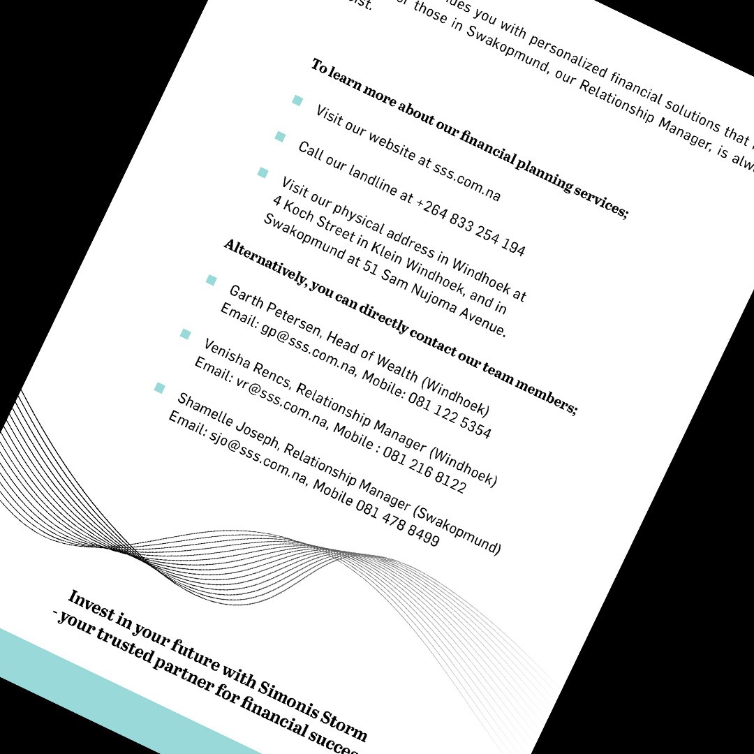
1. The "Breathable" Layout
The most striking feature is the generous use of white space (or negative space). Rather than crowding the page with charts and fine print, the design allows each element to "breathe." This communicates confidence; the company doesn't feel the need to overwhelm the client to prove its value.
Grid System: The layouts follow a strict, invisible grid, ensuring that text and graphics are perfectly aligned, which subconsciously signals stability and order.
2. High-Contrast Typography
Simonis Storm uses a typographic hierarchy to bridge the gap between legacy and innovation:
Serif Headers: They often employ a bold, modern serif font for primary statements (e.g., "Enriching Generations"). Serif fonts are traditionally associated with history, trust, and "The Establishment."
Sans-Serif Body: Supporting information is set in a clean, geometric sans-serif. This provides a functional, modern contrast that is easy to read on digital screens.
3. Sophisticated Color Palette
The brand moves away from the "corporate blue" cliché, opting instead for a palette that feels more organic and premium:
The Signature Accent: A muted Mint or Seafoam Green (resembling a sophisticated teal). This color suggests growth and "new money" while remaining calm.
The Foundation: Deep Charcoal/Black and Paper White. This monochrome base keeps the look formal and "expensive."
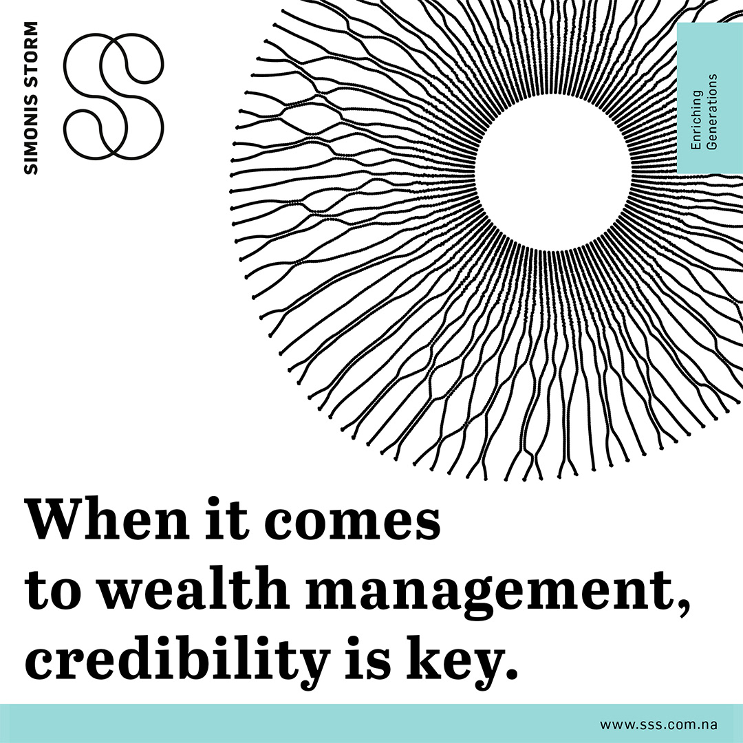
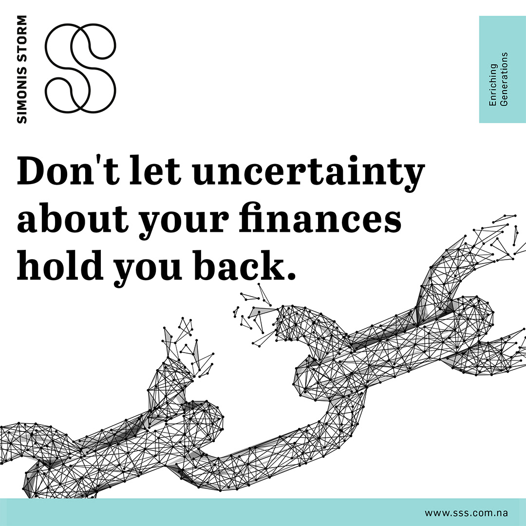
4. Abstract "Data-Driven" Imagery
Instead of using generic stock photos of people in suits, the layout utilizes abstract vector graphics:
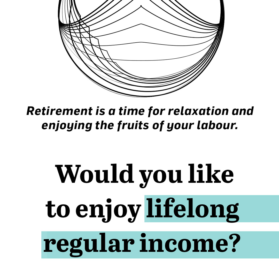
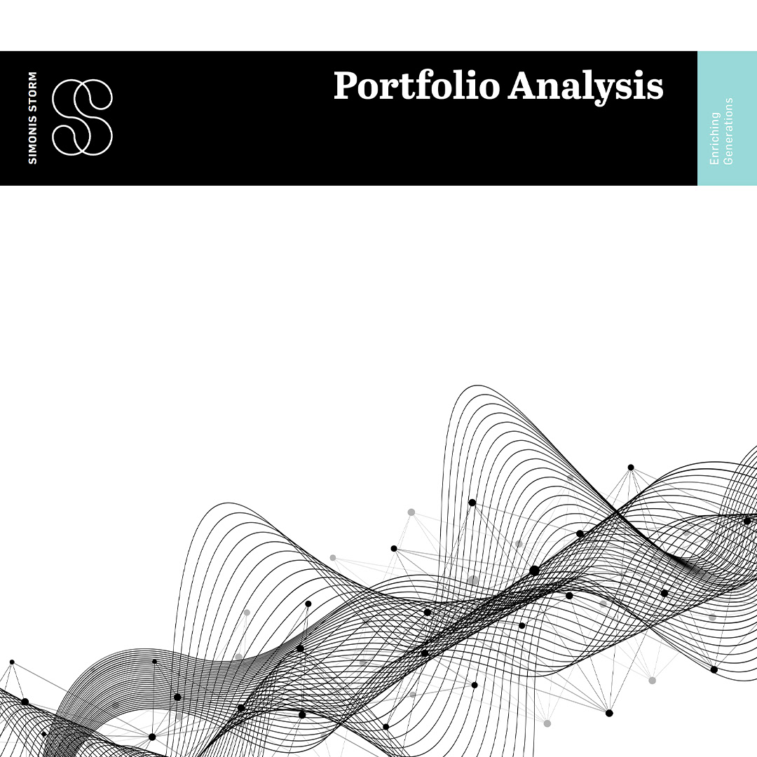
Linear Patterns: Fine, interconnected lines, wave patterns, or geometric spheres. These act as a metaphor for market fluctuations, networking, and the complex "web" of wealth management, rendered simply.
Flat Design: There are no drop shadows or 3D effects. Everything is "flat," which aligns with current high-end digital design standards.

5. Intentional Branding
The logo is never the loudest thing on the page. It is usually placed discreetly in a corner or used as a subtle watermark. The focus is shifted entirely to the message and the client's goals, which is a hallmark of minimalist luxury branding.
The style is designed to make the complex world of finance feel simple, transparent, and calm. It positions Simonis Storm as a firm that is sophisticated enough to handle complexity but modern enough to make it understandable
PROJECT: Layout Design
CLIENT: Simonis Storm
DESIGNER: Andrea Muller