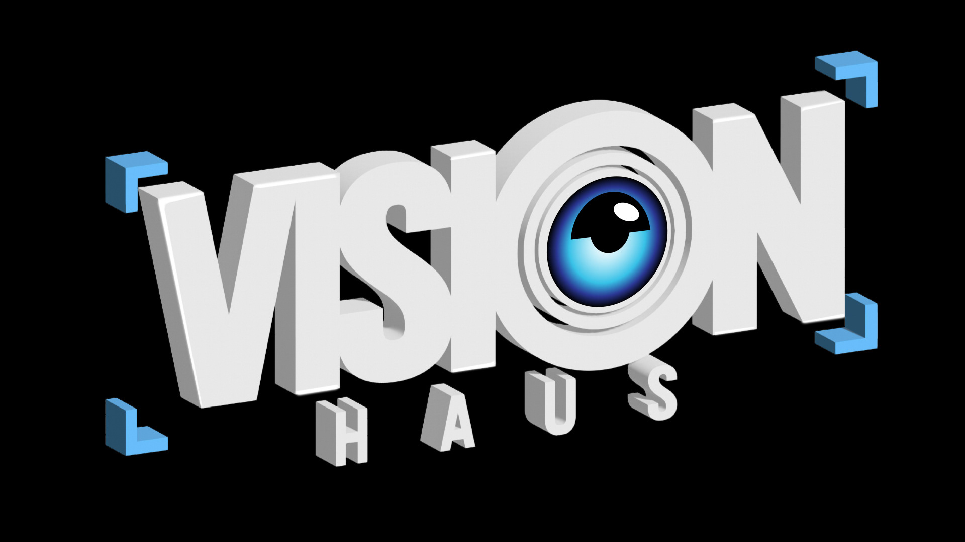
VISION HAUS LOGO DESIGN
This logo design for Vision Haus is a punchy, technical, and high-contrast identity that perfectly positions a young videography company as both professional and tech-forward.
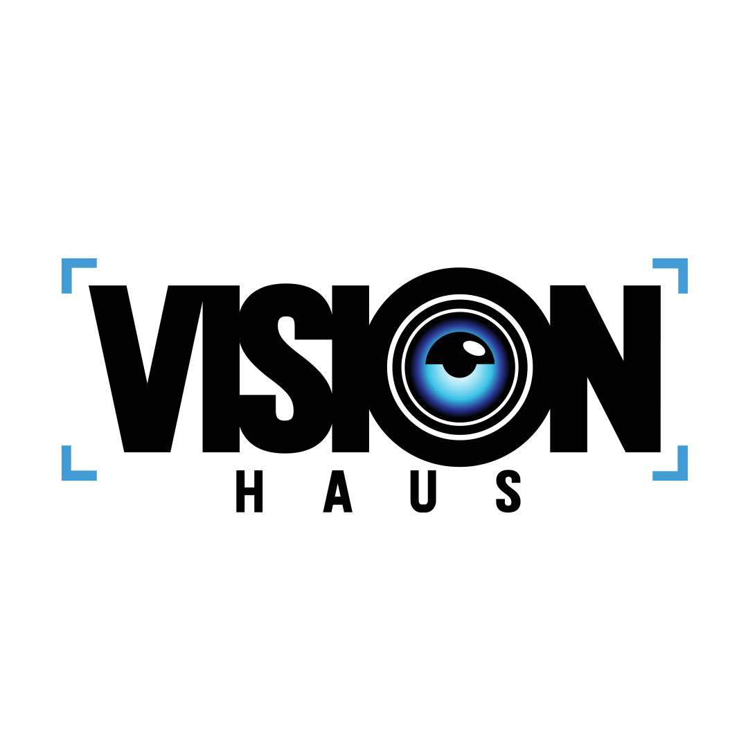
1. Central Iconography: The "Digital Eye"
The core of the logo is the integration of a stylized eye into the letter "O" in "VISION."
The Pupil: The lens-like iris uses a vibrant blue gradient, which suggests high-definition clarity and digital precision.
The Rings: The concentric circles surrounding the eye mimic a camera lens assembly, reinforcing the "vision" aspect of the brand name and the company's service.
2. Framing: The Viewfinder Brackets
The logo is framed by four "focus brackets" at the corners.
Context: This is a direct nod to the UI of a camera viewfinder or autofocus system. It tells the viewer immediately that this company works in film and photography.
Composition: These brackets create a "boundary" for the logo, giving it a solid, structural feel while ensuring the brand name remains the focal point.
3. Imagery & Composition
The layout relies on a "layered depth" approach:
Silhouettes & Frames: Thin white line-work frames and silhouetted palm trees act as "windows" into the beach scene, focusing the viewer’s eye on the center of the artboard.
Natural Textures: The use of macro photography—showing the texture of sea foam and water ripples—adds a tactile, premium feel to the digital posters.
Artist Integration: For the artist reveals, the portraits are high-contrast and desaturated or stylized to pop against the vibrant sunset, giving them a "larger-than-life" presence.
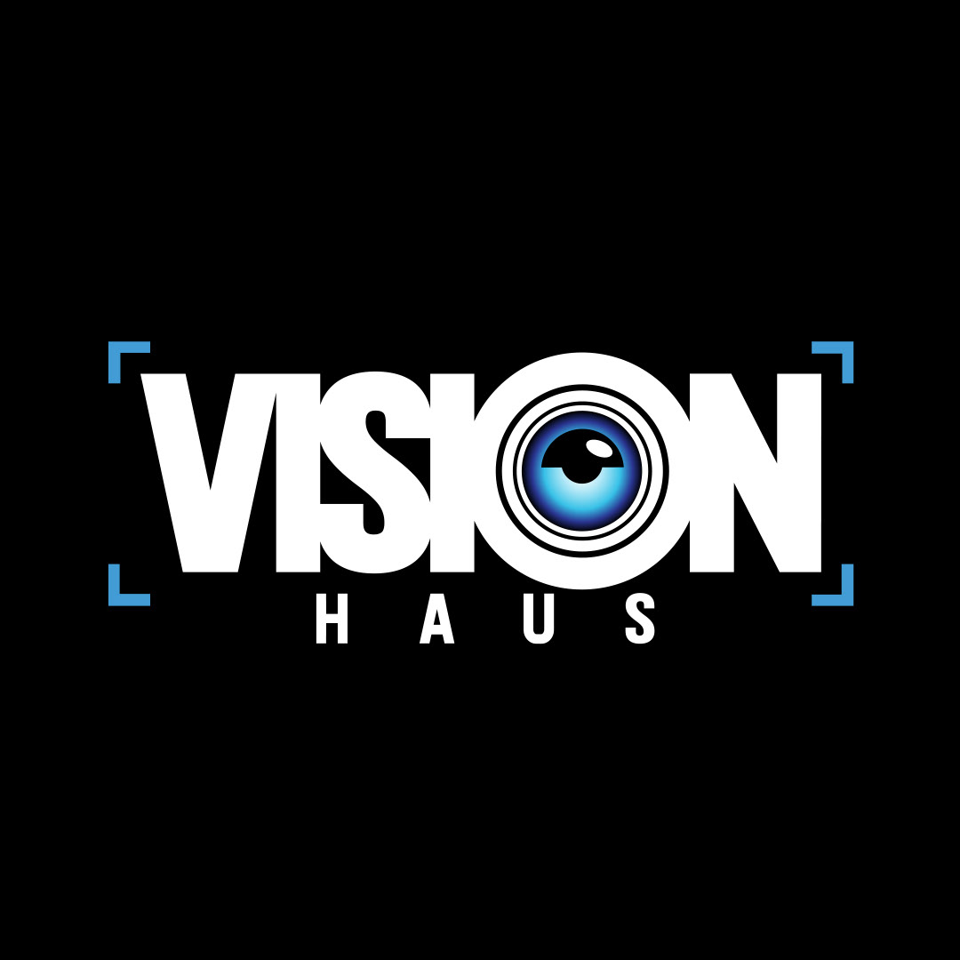
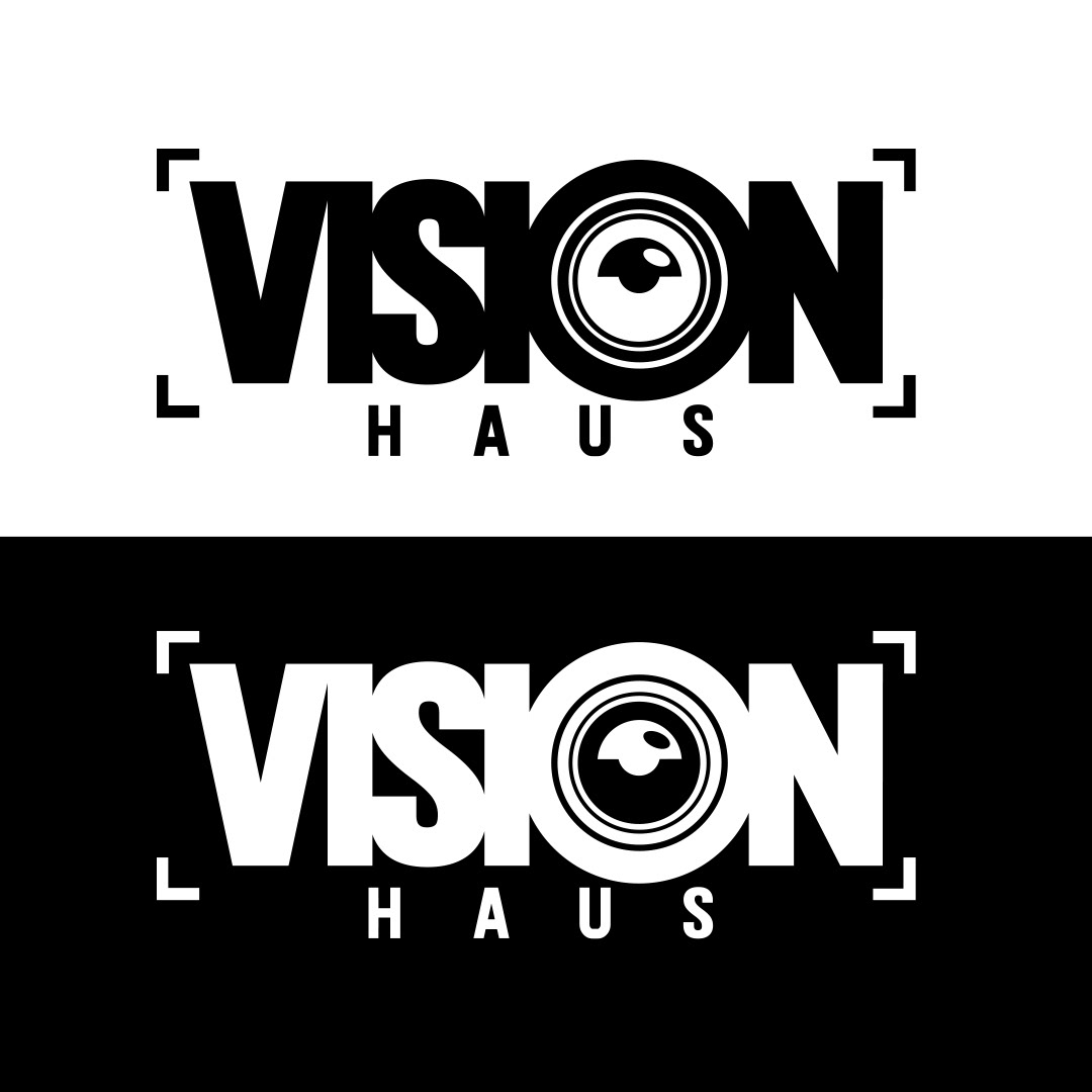
This design is highly functional for a videography company—it's legible at small sizes (like a social media profile pic) but has enough detail to look impressive on a large studio sign or a 4K title card.
PROJECT: Logo Design
CLIENT: Vision Haus Media
DESIGNER: Andrea Muller