WCTD BRAND IDENTITY AND APPAREL PATTERN DESIGN
The "WE COME TO DANCE" (WCTD) brand identity is grounded in high-energy, "maximalist" festival fashion. It strikes a balance between the gritty, underground techno aesthetic and the vibrant, playful spirit of mainstream EDM culture.
1. The Two Visual "Pillars"
The brand speaks to two distinct types of festival-goers through its color stories:
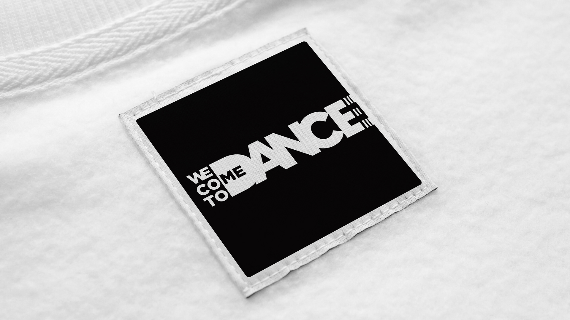
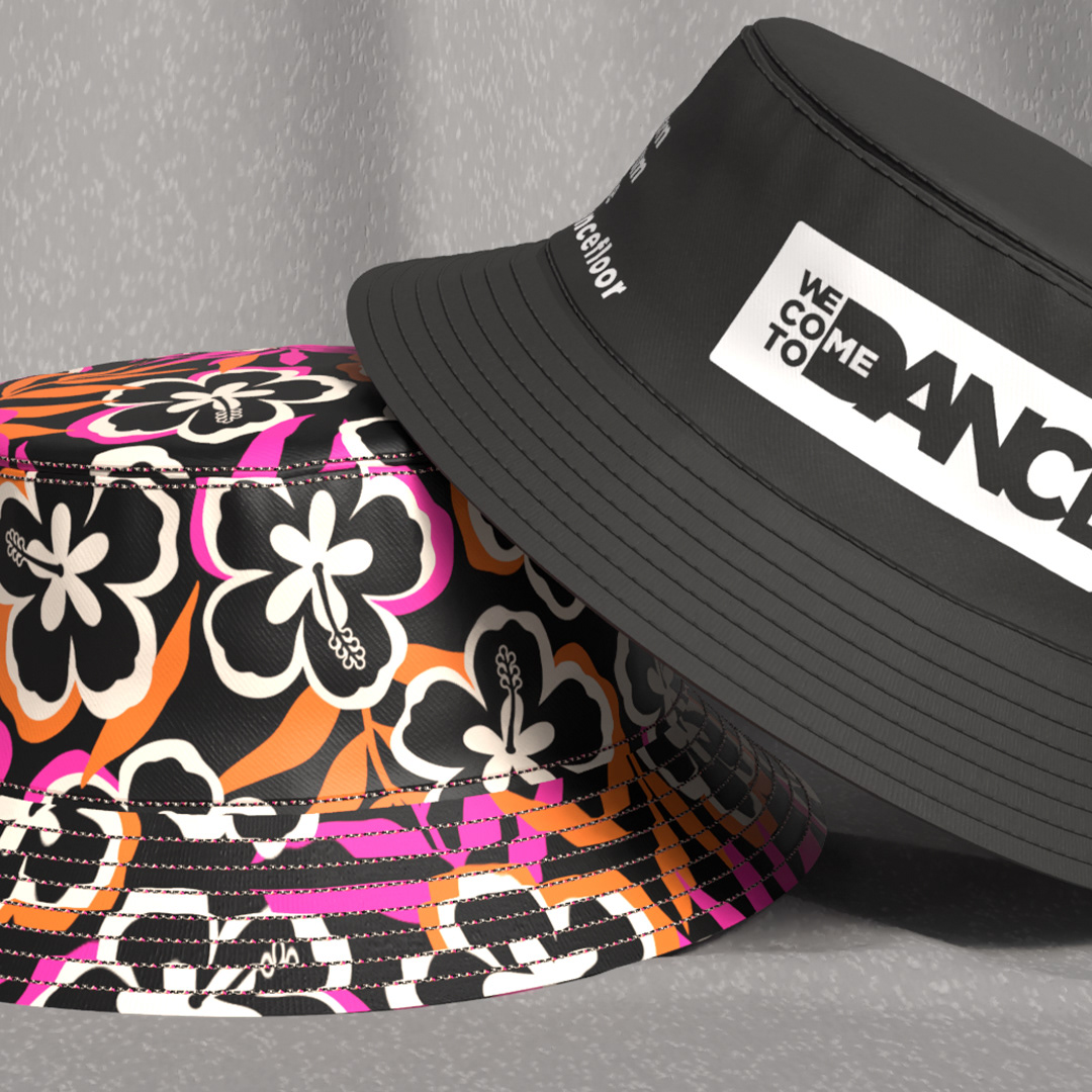
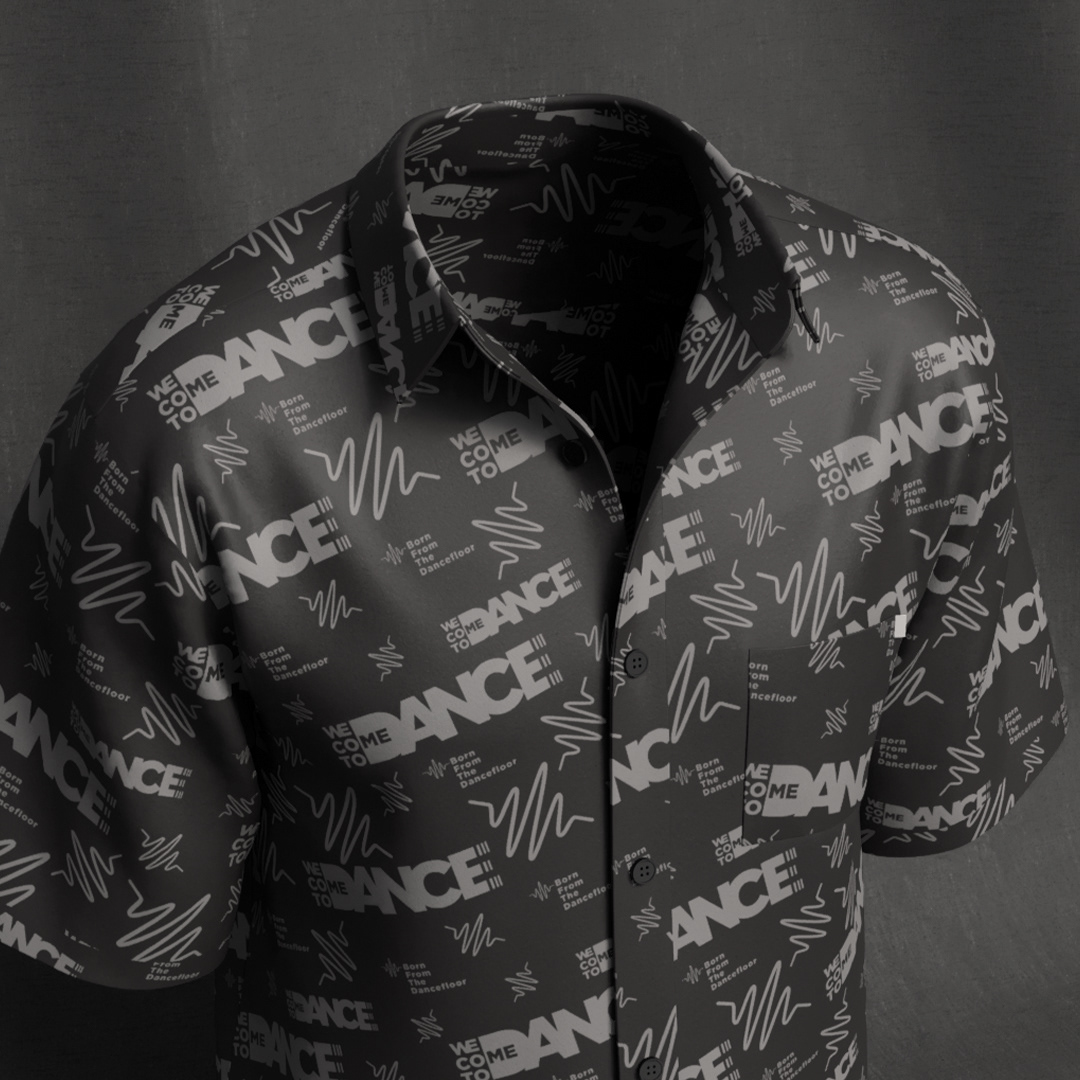
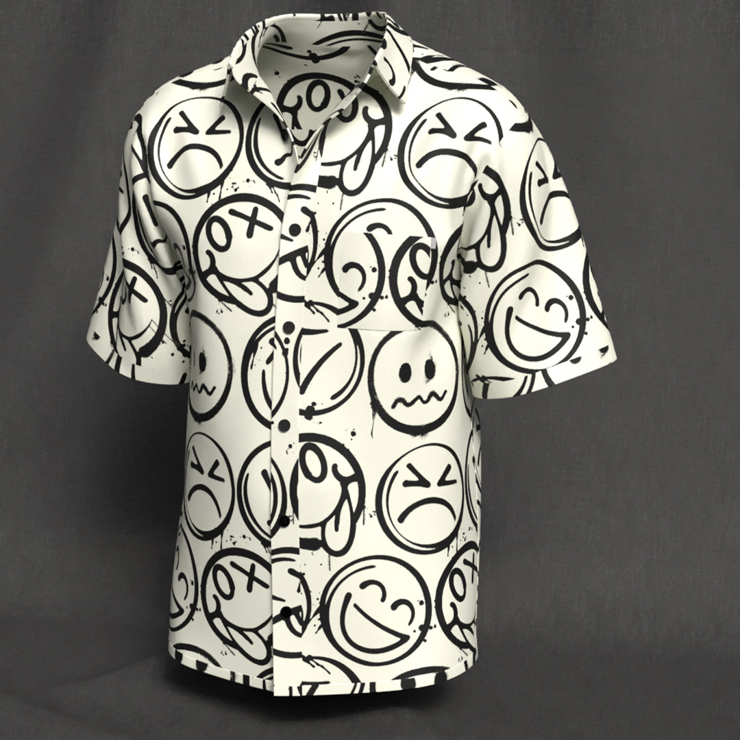
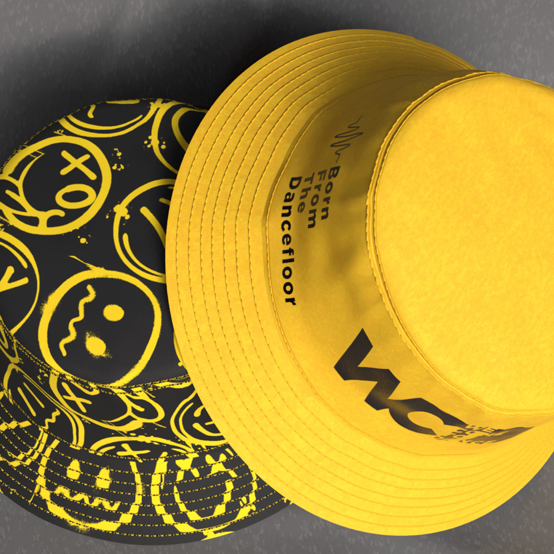
The Underground (Monochrome): This style uses a black-on-black or grayscale palette. It incorporates waveforms and the slogan "Born From The Dancefloor," appealing to the "all-black-everything" techno and house crowd.
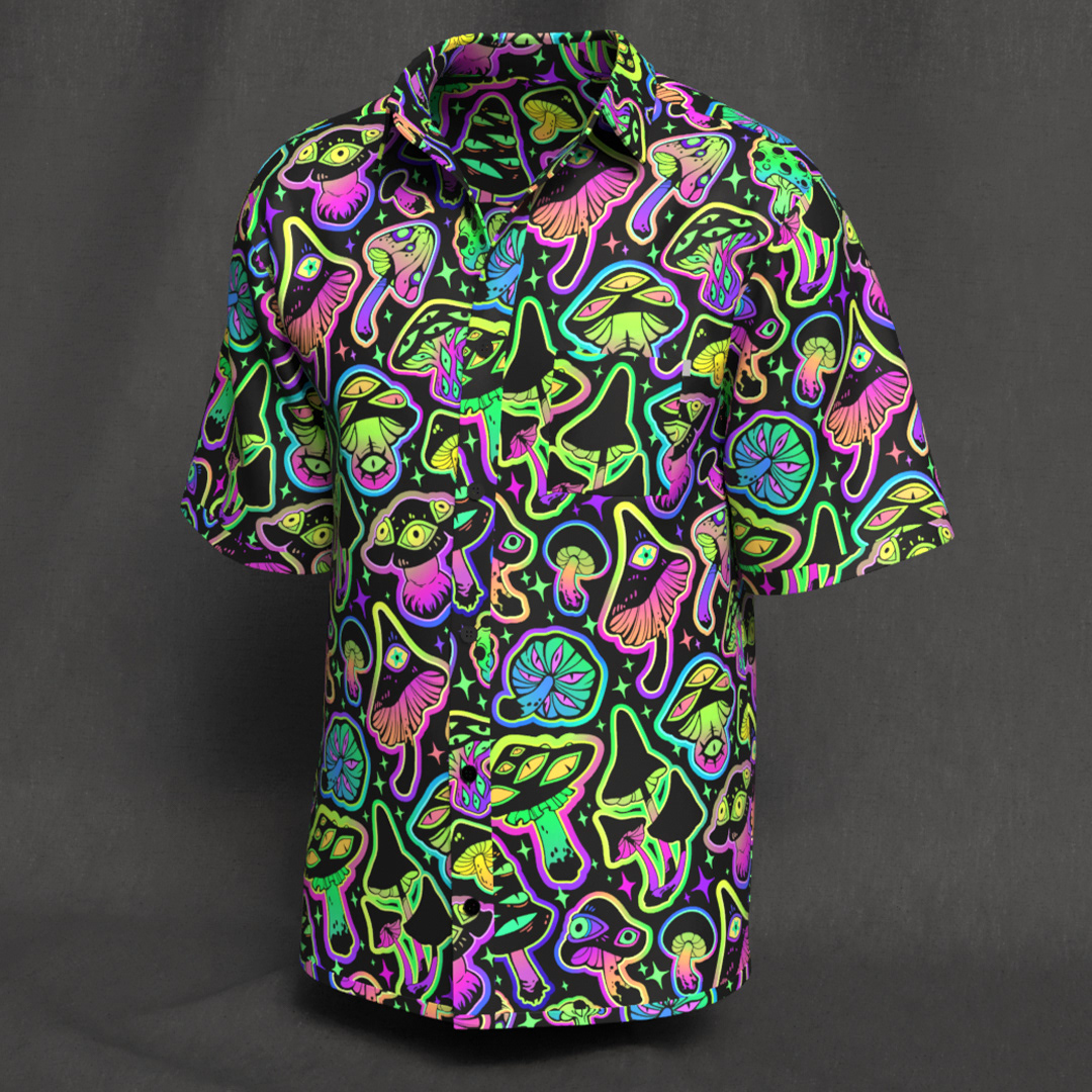
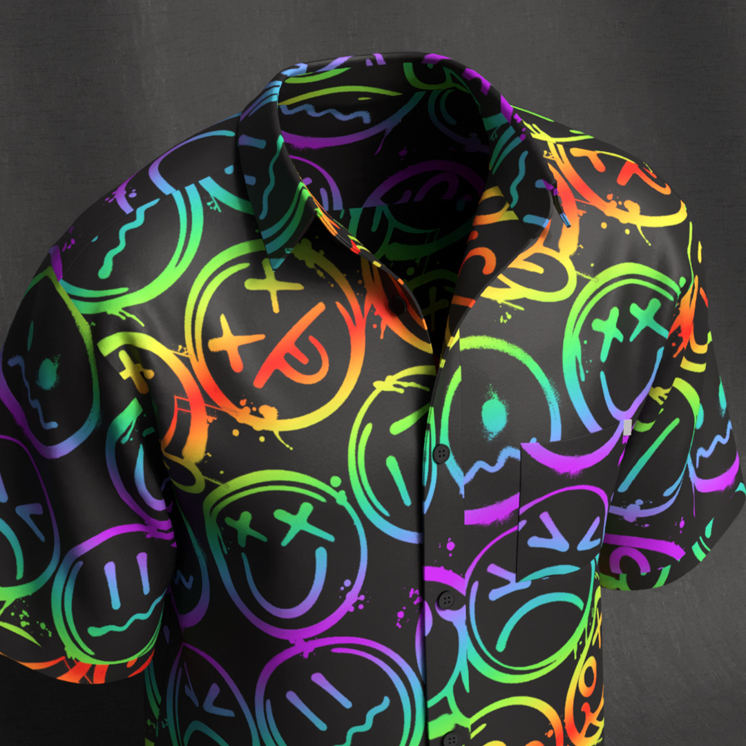
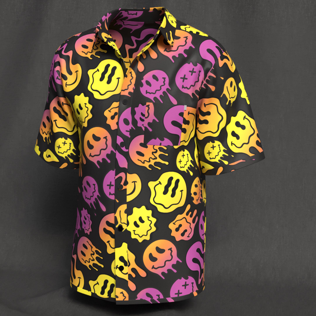
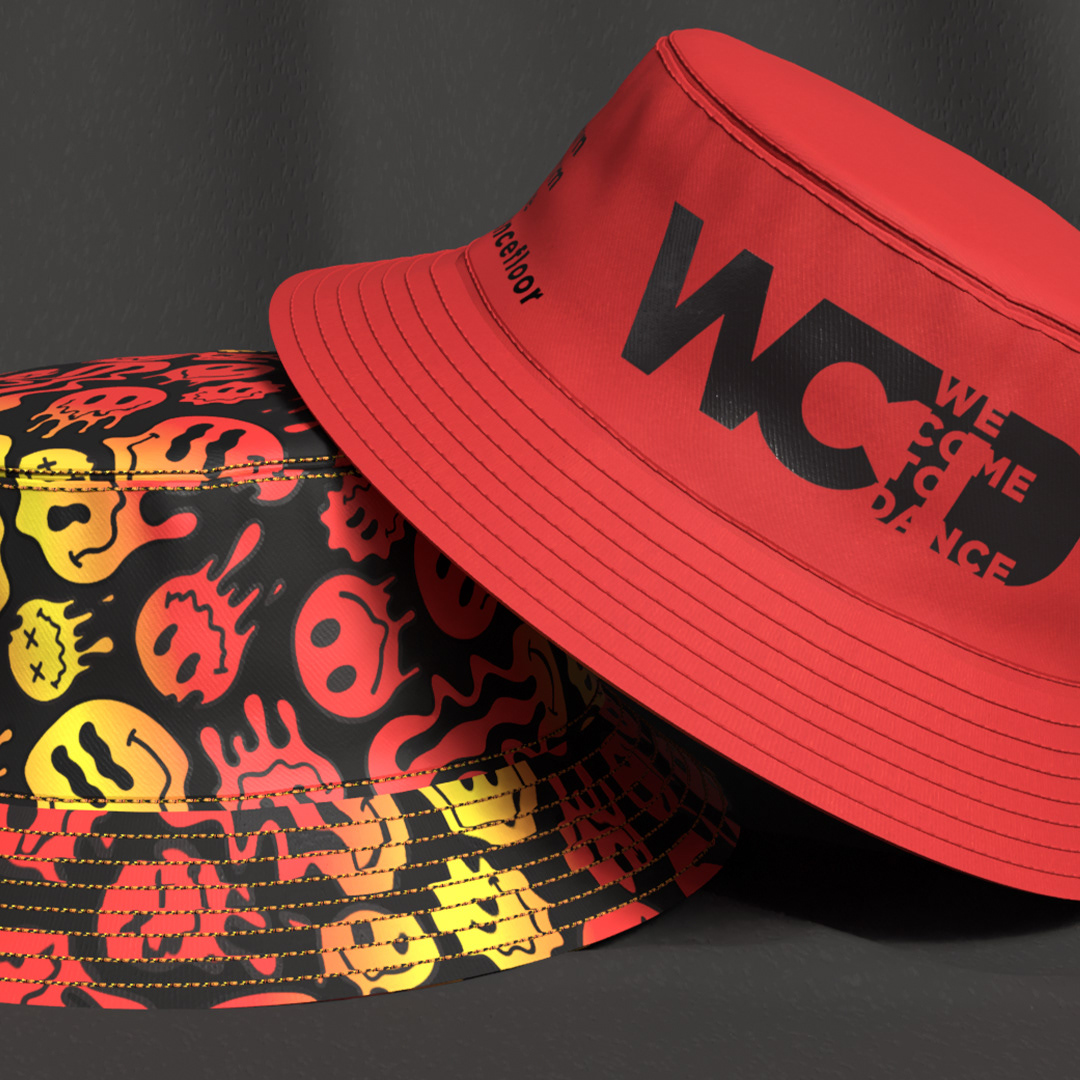
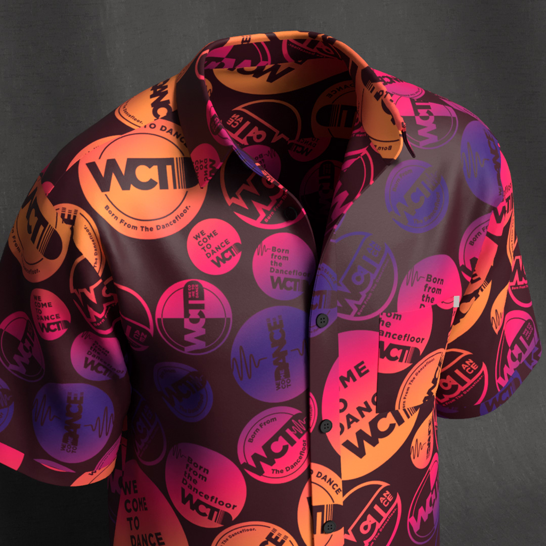
The Mainstage (Hyper-Vibrant): This is the high-visibility side of the brand. It uses high-contrast palettes—specifically neon pinks, electric oranges, and rainbow gradients—designed to stand out in sunlight and under UV blacklights.
2. Iconic Symbolism & Pattern Play
WCTD leans heavily into "All-Over Prints" (AOP), which are a staple of festival streetwear:
The "Acid House" Smiley: The brand updates the classic 90s rave smiley with "melting" and "graffiti" textures. This adds a psychedelic, trippy edge that feels modern rather than purely nostalgic.
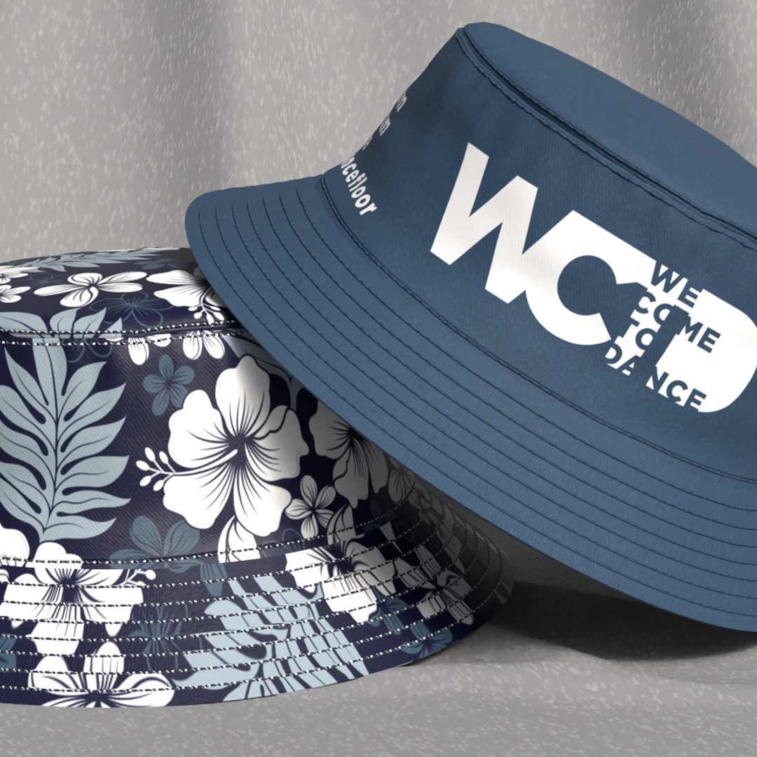
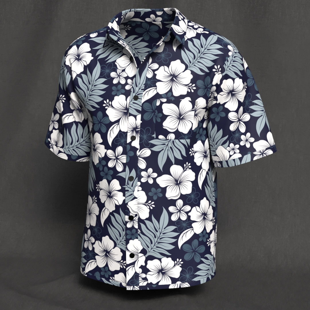
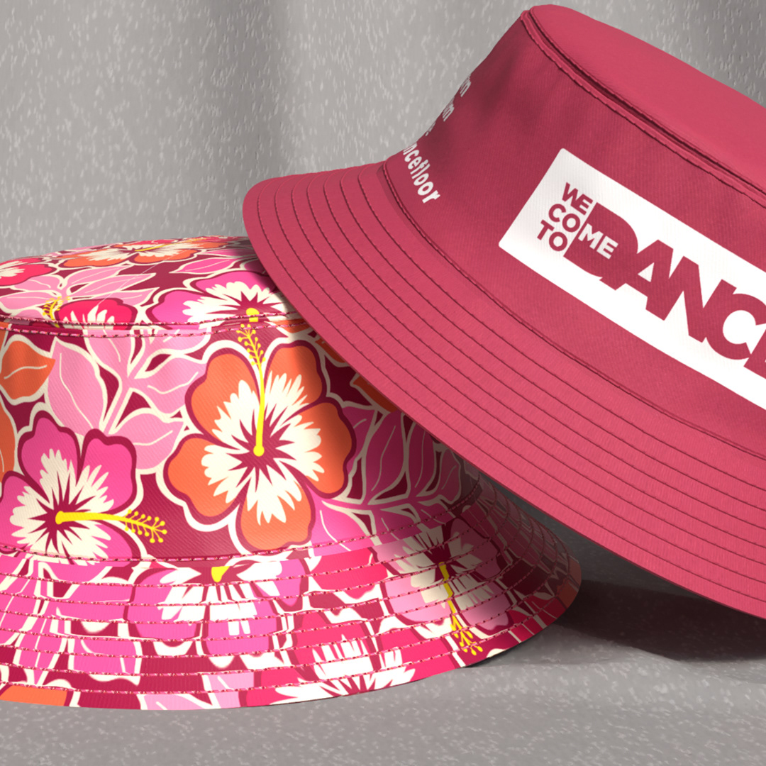
High-Contrast Tropical: The use of the hibiscus flower leans into the "Summer Festival" vibe, but by using black, hot pink, and orange instead of soft pastels, it remains aggressive and energetic rather than "beachy."
Waveforms: The inclusion of audio waveforms as a textural pattern reinforces the brand’s deep connection to the music itself.
3. Visual Language:
Aesthetic: "Post-Rave Maximalism." It’s loud, un-apologetic, and high-contrast.
Tone: Inclusive yet Intense. The name is an invitation, but the visuals are bold and demanding of attention.
Functionality: The designs prioritize visibility. Whether it’s a bucket hat or a button-down, these pieces are "identity markers" meant to help friends find each other in a crowd.
PROJECT: Brand Identity and Apparel Pattern Design
CLIENT: We Come To Dance
DESIGNER: Andrea Muller